2025 / MOBILE APP DESIGN /
REDESIGN KYC JOURNEY
Designing trust at the first touchpoint of investing


Timeline
Aug - Sep 2025
Key Areas
UX Strategy, Product & UI Design, IA, Usability Testing,
Visual Design
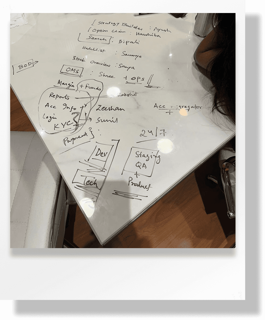
Collaborators
1 Product Designer, 1 Product
Analyst (IIT KGP), 3 Engineers
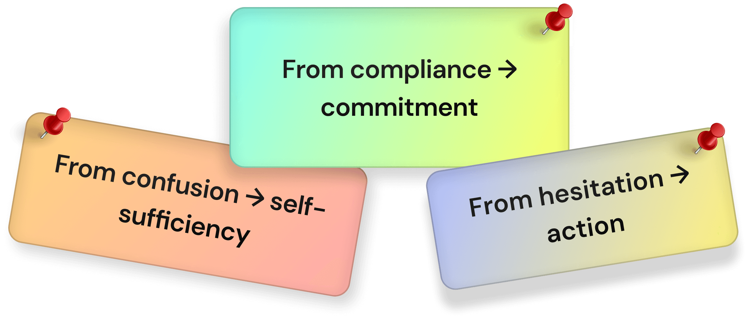
Yes, I redesigned the SEBI-mandated stock broker (Nubra) KYC journey to shift the experience from compliance-heavy to guidance-driven. By introducing step-by-step clarity, visible progress indicators, real-time validations, and trust-building micro-interactions, the flow becomes more intuitive, transparent, and reassuring for users.
My Role as Sr. Product Designer, I led the product design for this user journey, prototyping, user flows, & product strategy.
WAIT, WHAT’S NUBRA?
Nubra is an all-in-one trading platform by Zanskar, built for everyone from beginner investors to advanced traders. It brings together powerful tools like advanced option chains, multi-leg strategy builders, live market scanners, institutional-grade charts, and deep research—all in one place.
WAIT IS KYC?
It is the step where a platform confirms “you are who you say you are” before letting you invest or trade.
PROJECT OVERVIEW
(STORYTELLING-STYLE)
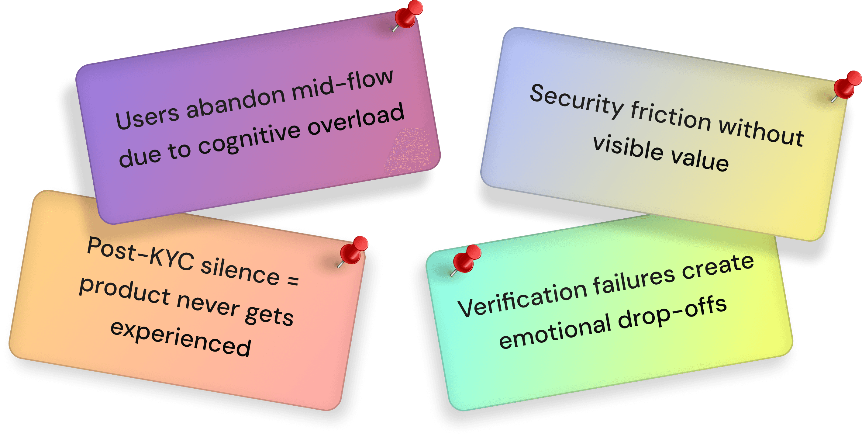
For most users, KYC is the very first interaction they have with a stock broker. And unfortunately, it often feels slow, confusing, and intimidating.
Imagine a first-time investor opening a broker app with excitement to start investing — but instead, they’re met with long forms, unclear document requests, and silent loading screens. Within minutes, excitement turns into doubt. “Is this safe? Am I doing this right? Why is this taking so long?” Many users drop off before they even reach the market.


DRAG TO MOVE
PROBLEM STATEMENT
At Nubra, the KYC journey was the user’s first real product experience, yet it was fragmented, high-friction, and silently losing customers. Users weren’t just failing KYC — they were disengaging from the platform before ever experiencing its core value. The business impact wasn’t only compliance risk, but lost trust, lost AUM, and lost long-term users.
The impact of
doing nothing
INTRODUCING KYC STEP-BY-STEP
Existing KYC Flow :
document verification
segment selection
bank details
personal details
nominee details
e-sign check
New KYC Flow :
document verification
segment selection
bank details
personal details
nominee details

UNDERSTANDING OUR KYC USERS
USER NEEDS VS BUSINESS NEEDS
User Needs :
• A fast, interruption-free onboarding flow
• Clear guidance at every step
• Confidence that their data is safe & used correctly
• Immediate value after KYC completion
Business Needs :
• Minimize KYC and activation drop-offs
• Stay SEBI-compliant with evolving norms
• Minimize manual reviews and operational load
• Build early trust in the brand experience
APPROACH 1: ZERO CHOICE KYC (AUTO-TRIGGERED FLOW)
Idea :
Automatically start the full KYC process immediately after sign-up with no optional skips — users are pushed straight into verification.
Why it failed ❌ :
• Users felt forced before understanding the value of the platform
• Increased anxiety and drop-offs at the very first screen
• No sense of control → trust erosion
Learning :
Users need context before compliance. Forcing KYC without motivation creates resistance, not completion.

APPROACH 2: ONE SCREEN KYC (ALL-IN-ONE FORM)
Idea :
Compress all KYC inputs (personal info, PAN, bank, document upload) into a single long screen to “save time.”
Why it failed ❌ :
• Cognitive overload → users abandoned mid-scroll
• Errors were hard to spot and fix
• Felt like “too much work” in one go
Learning :
Speed isn’t about fewer screens — it’s about lower mental load. Chunking beats compression.
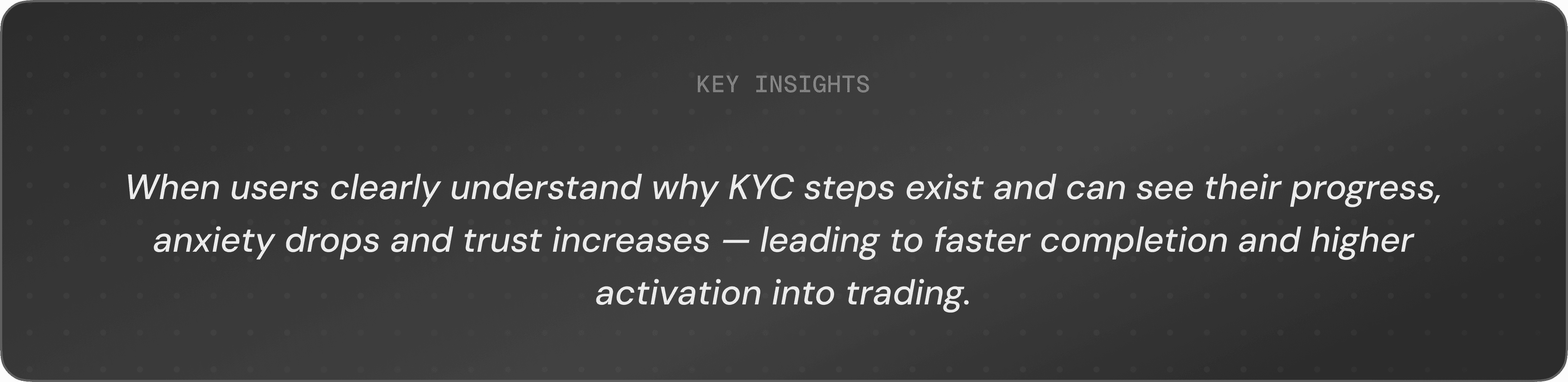
APPROACH 3: SMART, GUIDED & MOMENTUM-DRIVEN KYC
Idea :
Split KYC into short, goal-oriented steps (e.g., Identity → Bank → Verification) with a visible progress bar or stepper and time estimates.
Why it worked ✅ :
• Reduced anxiety with visible completion progress
• Built momentum to complete till the final step
• Lowered abandonment by making progress feel tangible
Learning :
People finish what they can see — clarity drives completion.

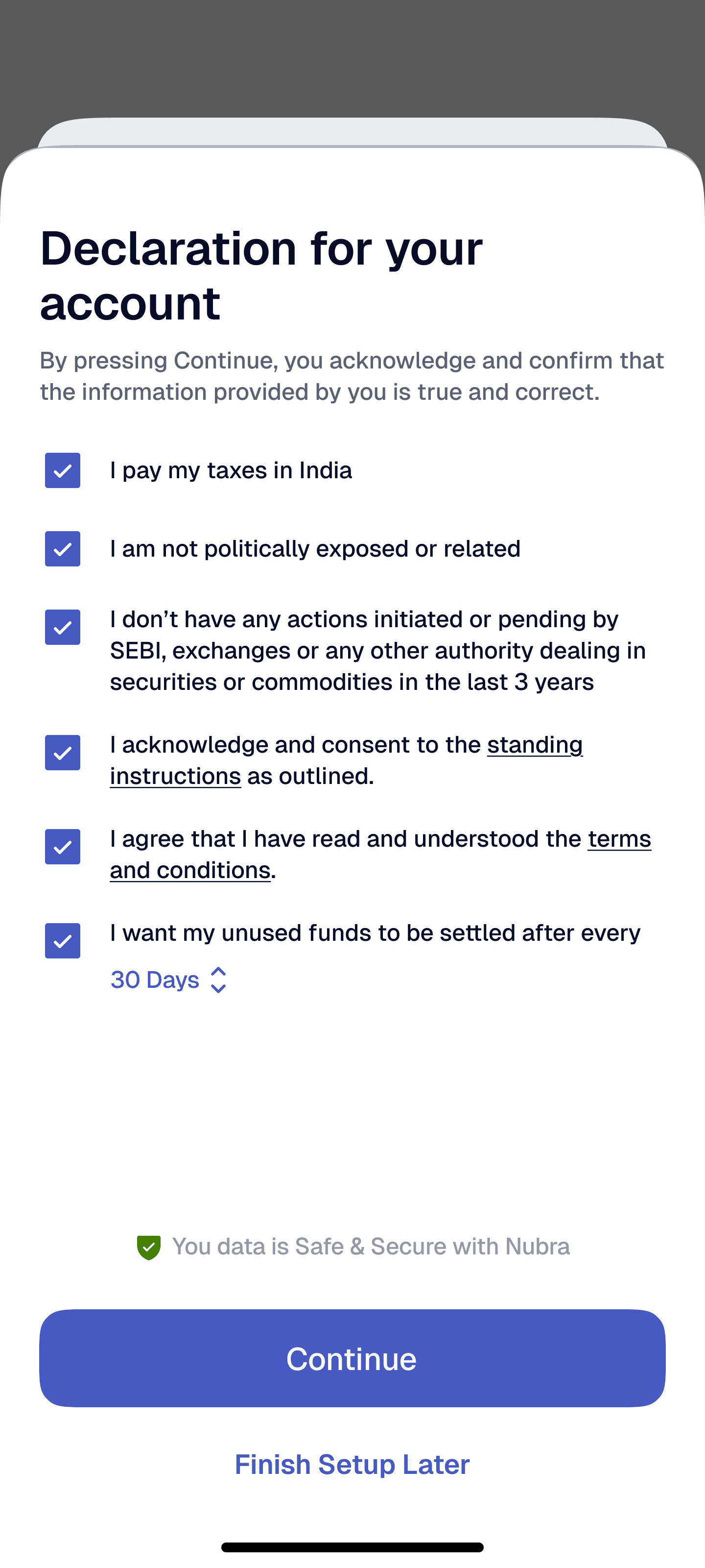
BASE OF FINAL UI DESIGN WITH UX
EXPLANATION
Stepper that shows progress and current step clearly + help icon for more details
Safety badge that builds trust around data security
Simple, structured inputs for quick entry
CTAs actions for proceed or finish later

FEW FINAL KEY SCREENS WITH UX
EXPLANATION
Stepper that shows progress and current step clearly + help icon for more details
For KRA users who already got fetched their docs, can access CTA to change the address, If needed
Pre-filled in original format for easy verification + CTA to change PAN
CTAs actions for
verify or finish later
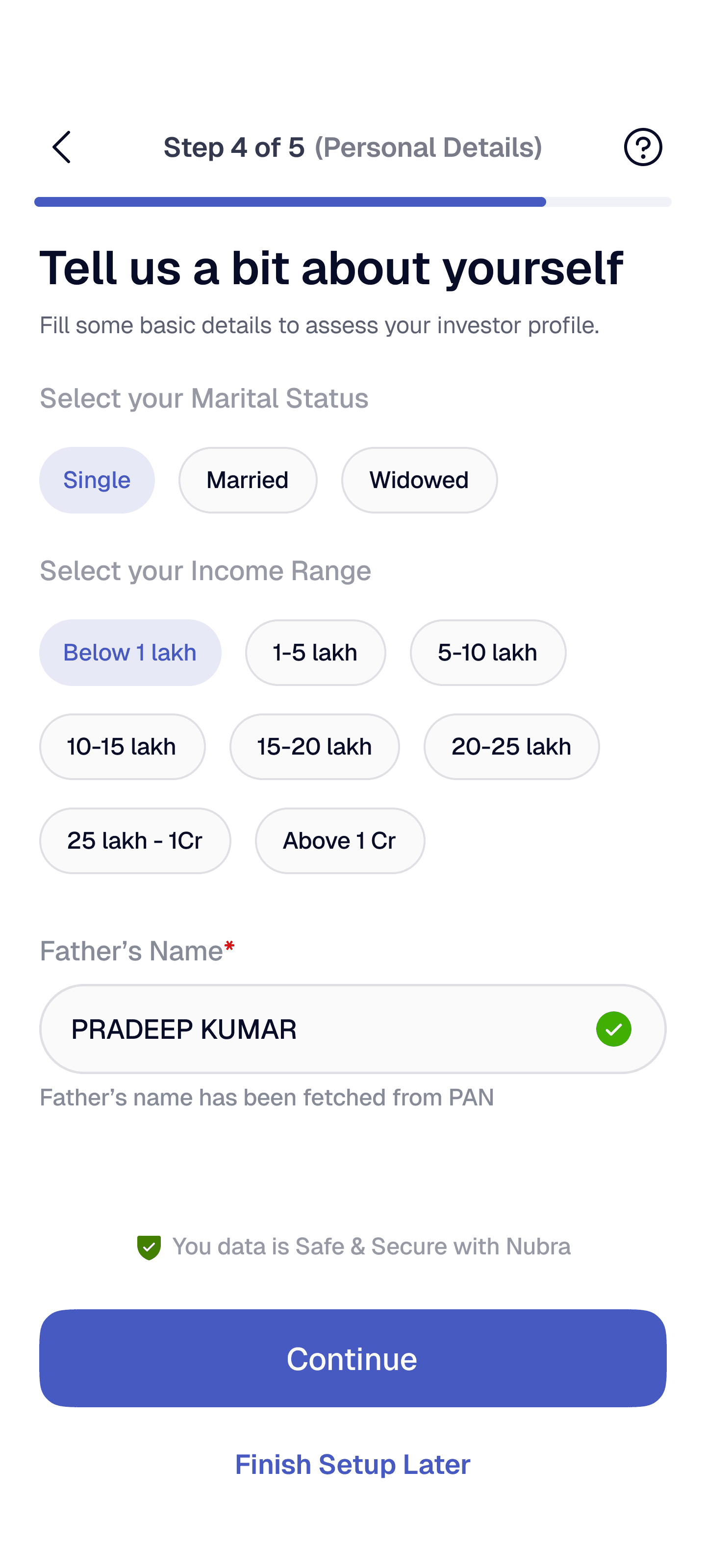
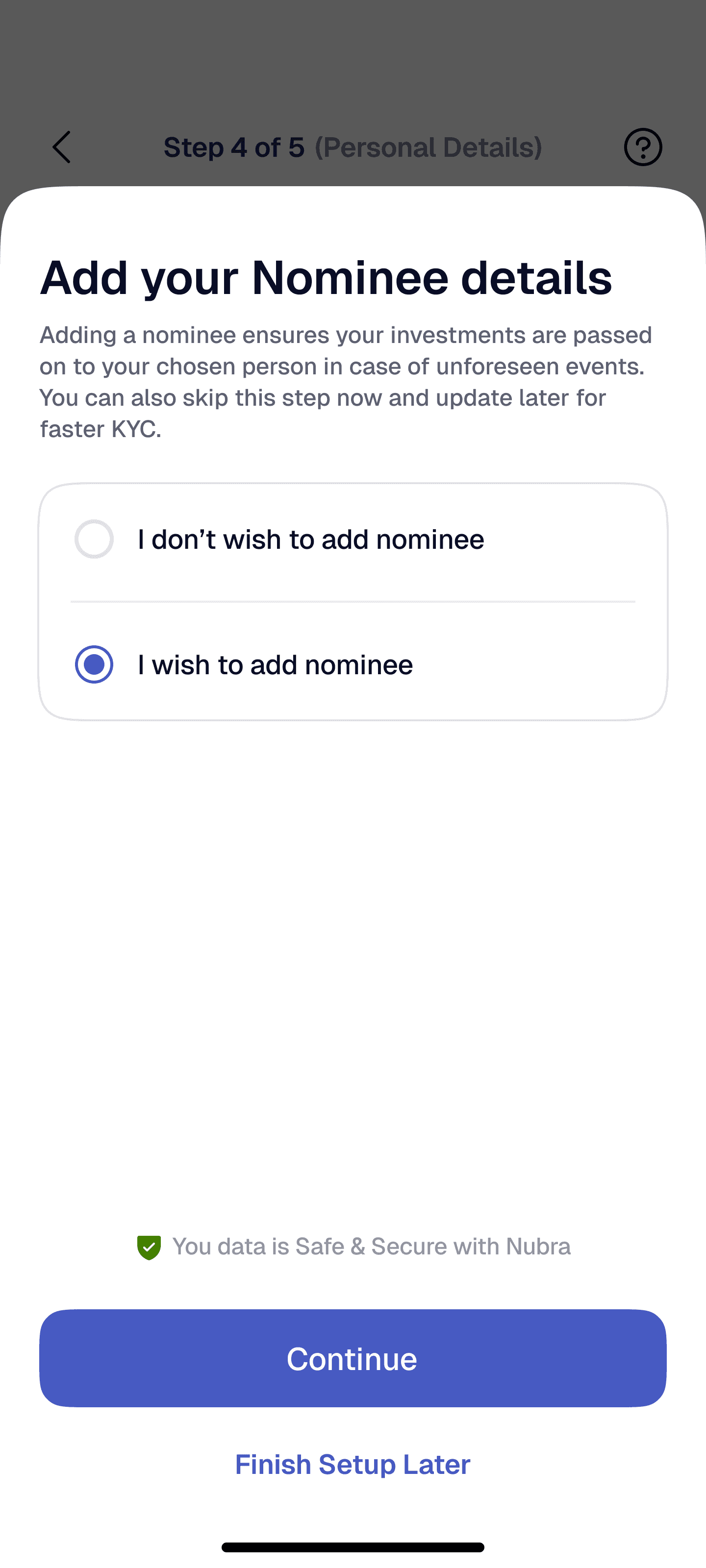
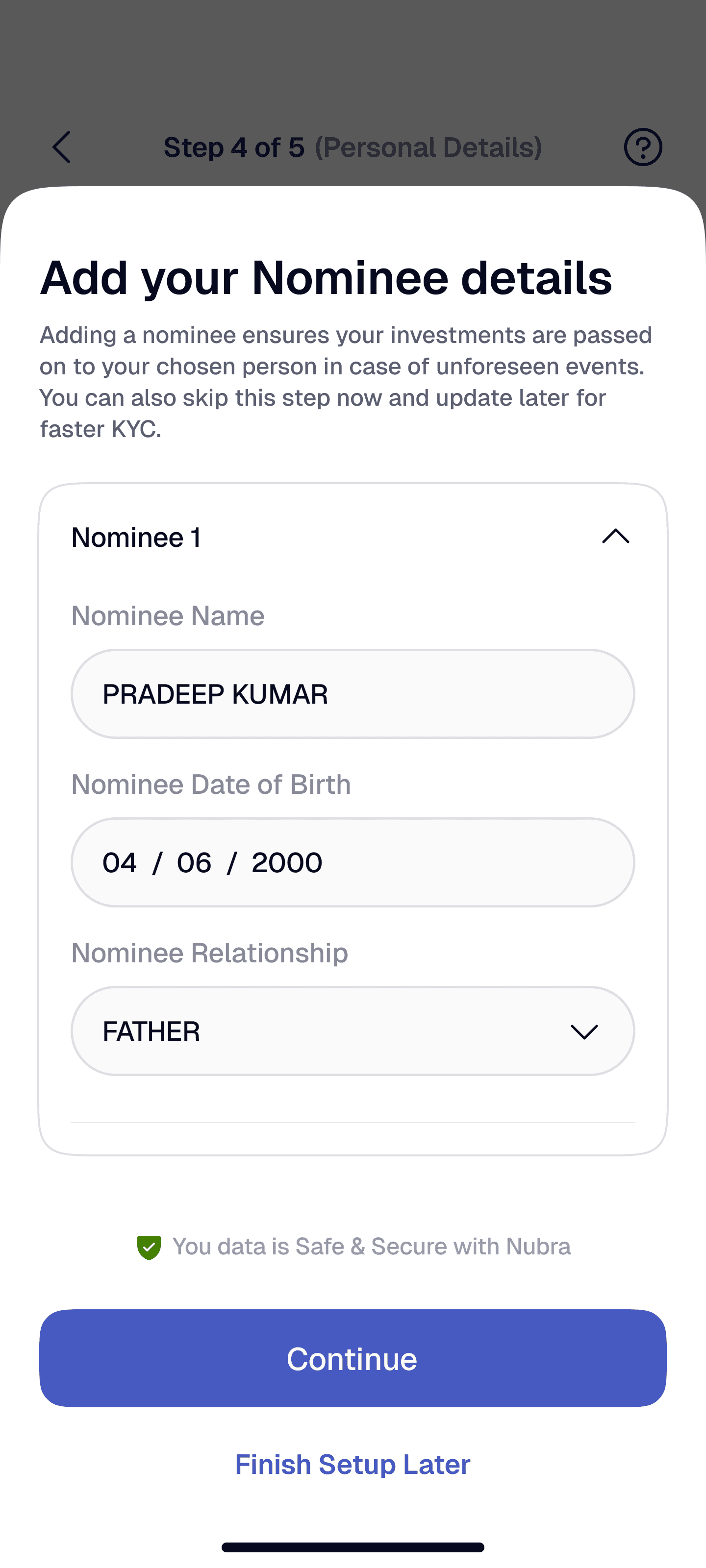
FEW FINAL KEY SCREENS WITH UX
EXPLANATION
Stepper that shows progress and current step clearly + help icon for more details
Visual breakdown of 3 steps for clear upfront guidance for users
CTAs actions for proceed or finish later

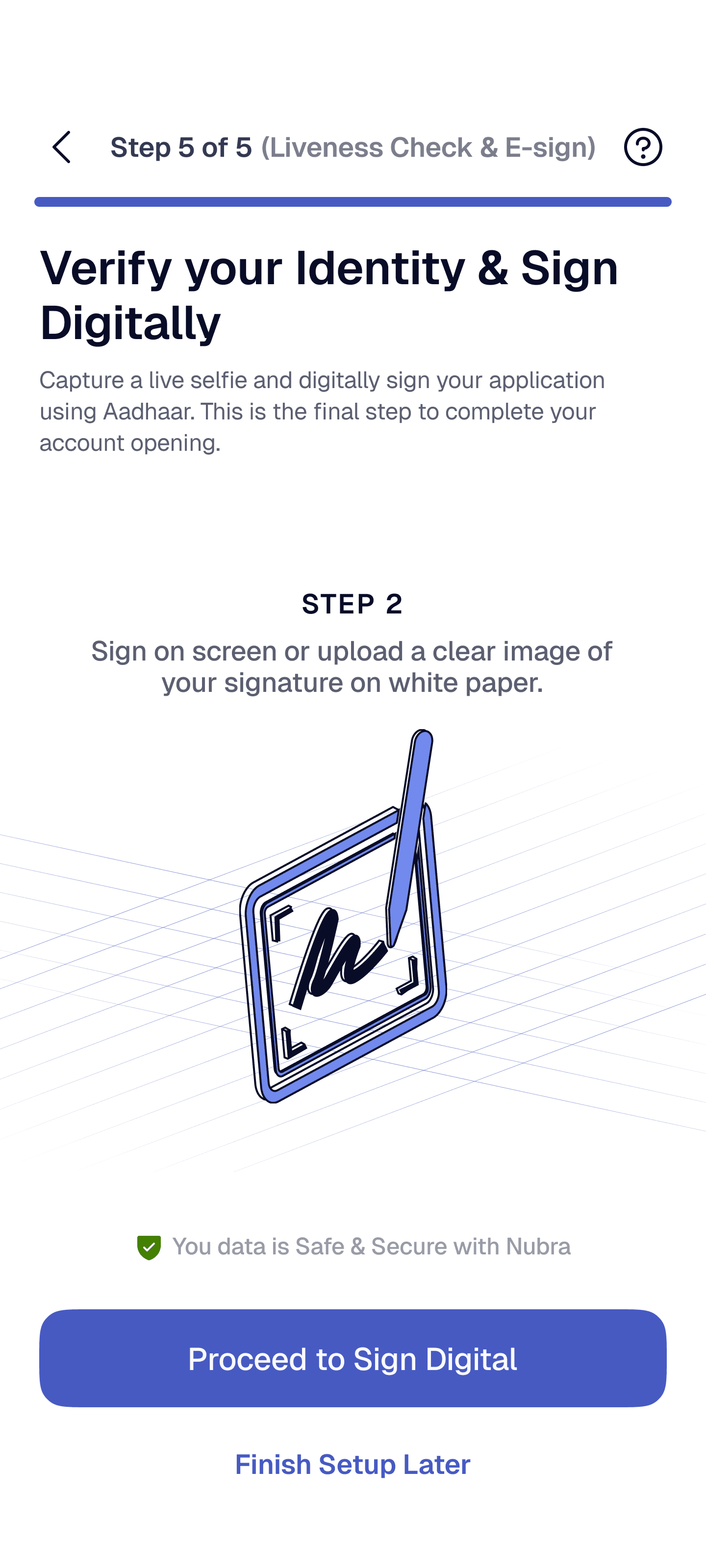
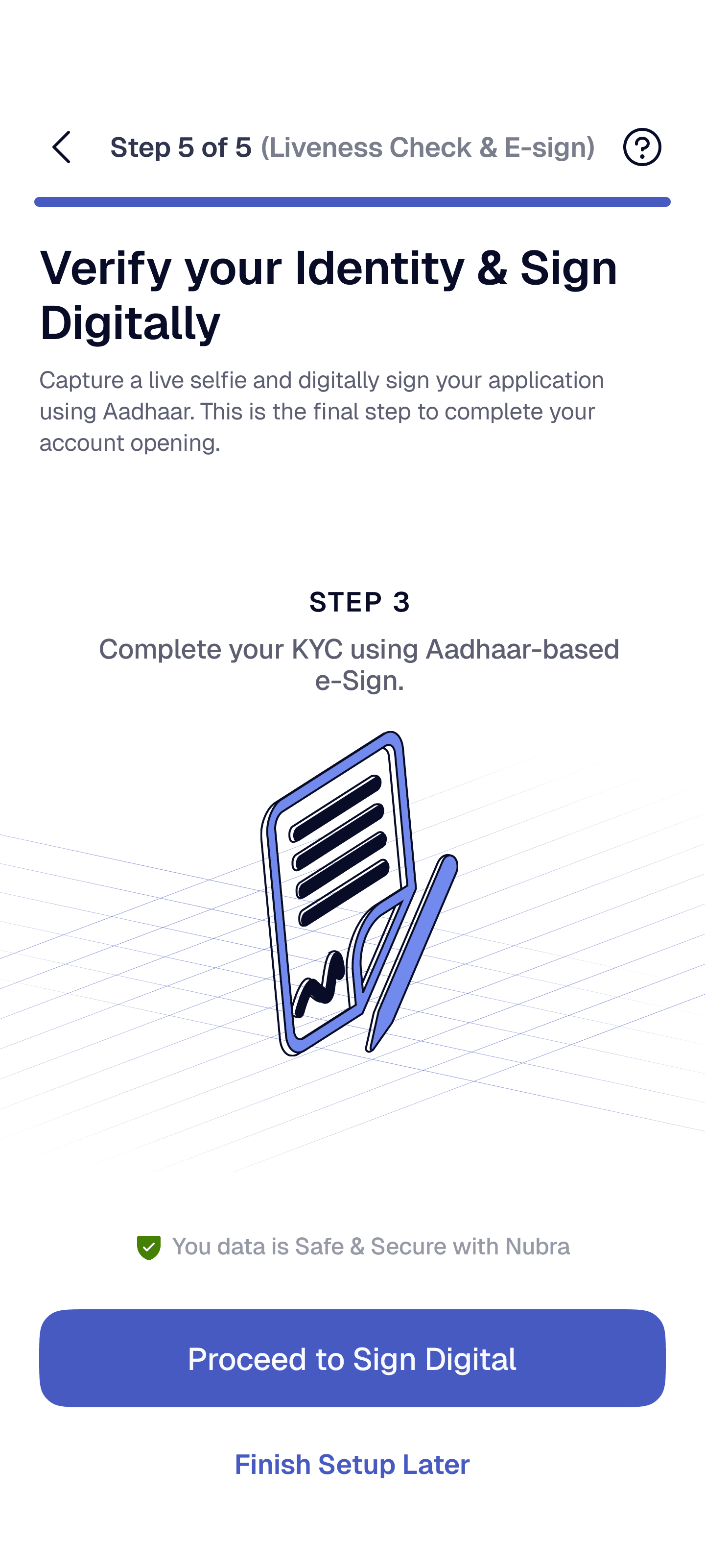
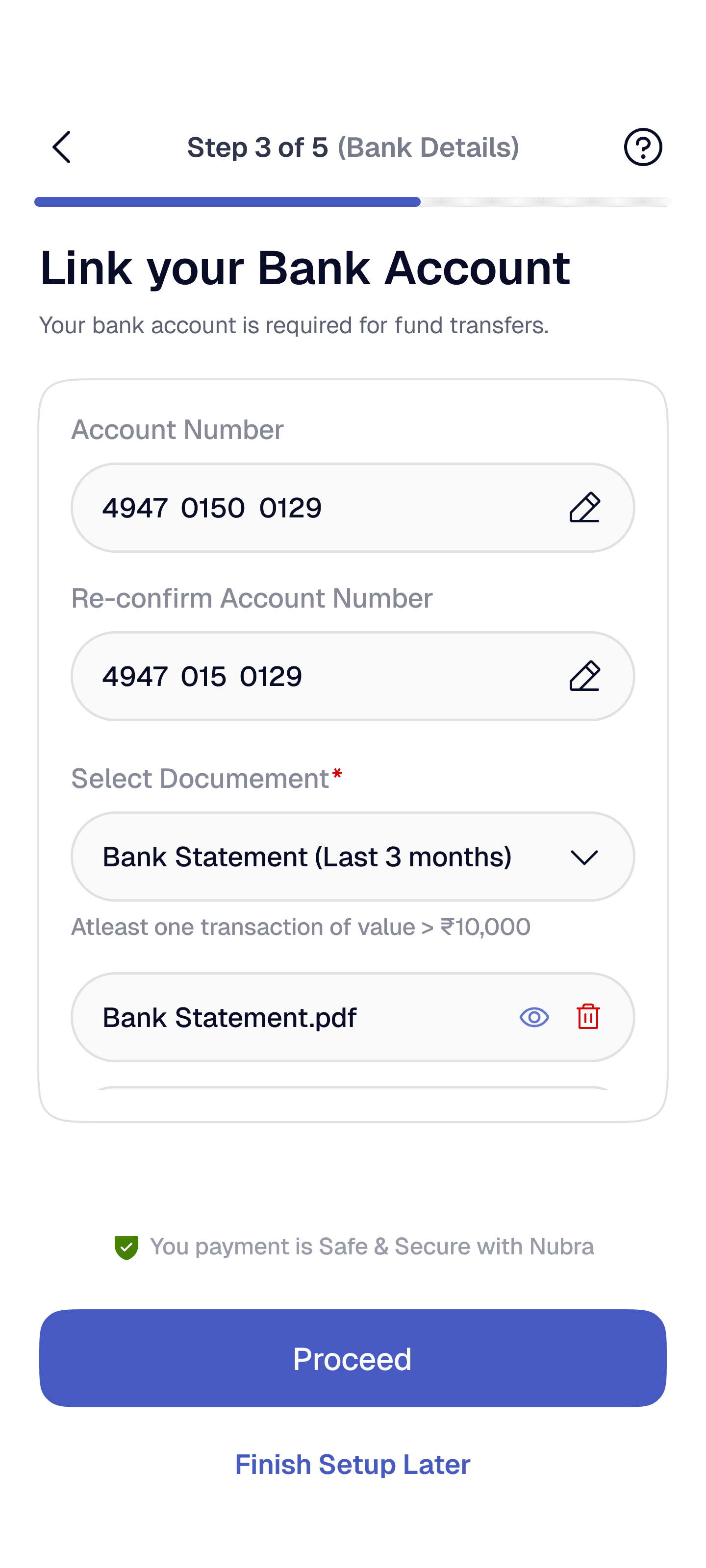
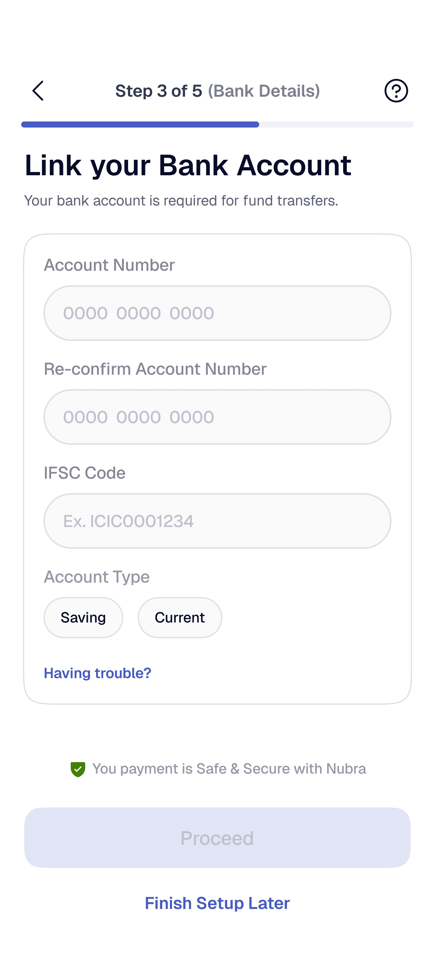
FEW FINAL KEY SCREENS WITH UX
EXPLANATION
Stepper that shows progress and current step clearly + help icon for more details
Verified bank details
for secure verification
+ CTA to update bank
CTAs actions for proceed or finish later


WHY USER TESTING WAS A KEY STEP
What need to be validated :
We tested whether the new flow actually improved behavior, not just visuals:
• Can users complete KYC without external help?
• Do users understand why each step is required?
• Does progress visibility reduce drop-offs?
• Do users control in document & video steps?
• Is anxiety lower during identity verification?
• Do users trust increases after KYC?
OUR TESTING SETUP
Method :
• Remote + moderate usability sessions
• 15-20 mins per participant
Participants :
9 users total
• 5 First-time investor
• 4 Active traders
Tasks :
• Start KYC and complete PAN + Aadhaar verification
• Complete all 5 KYC steps
• Submit KYC & view next steps
Behavioral
Impact